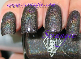
Do you see what that says??? First of all, the orange and yellow and green color in the bottle? NOT REALLY THERE. It's just a metallic green-tinted black. Also, HOLOGRAPHIC?! This polish is NOT a holographic. This is what a holographic black looks like,

This really bothers me because it's COMPLETE false advertising. How much cooler does the picture in Vogue look?? Black, blue, yellow, orange, green, holographic! So cool! But then you get it and it's just a plain 'ol metallic. I mean, don't get me wrong, it's a nice color, and it's definitely the star of the Chanel Spring 2011 makeup collection, but rainbow holo? No way jose. Also, I feel like the magazine is just pushing this color because it's new and it's Chanel. I love Chanel and I think they always have their finger on the pulse of new trends, but the way Vogue makes it seem soo cool and then...psych! I know I seem like I'm getting a bit crazy about this, but it's only because, how many people will see/read that, spend $25 or more (with the shipping) on it, and get it only to discover it's not even CLOSE to what the picture and description say! I can't believe Vogue would print this kind of mistake...was mine a fluke? Comment if you found one with a picture representing the REAL Black Pearl.


No comments:
Post a Comment